Hi Everyone!
It has been a really interesting almost year and a half since the world first shut down due to the pandemic. Here in Montreal, we have spent the better part of it in lockdown and with a curfew – a completely new way of life for most of us. While there have obviously been challenges there has also been opportunities for self discovery. I learned to enjoy the peacefulness of parts of my life and to lean into the slow down. The idea of rushing back into large and rowdy crowds hold little appeal to me at the moment. One thing that I am looking forward to is travelling and once I am able to do so, I plan to take a trip where I can breath, relax and enjoy my surroundings without feeling rushed or anxious…my current idea of heaven.

Until then though, I am dreaming about destinations that would fit the bill and today’s Dream Destination feature has been at the top of my list for months. Images of Casa Aviv by Co-Lab have made it’s way around social media these past few months. Surrounded by lush greenery, this minimalistic structure that leans towards austere simplicity offers both calm and privacy.
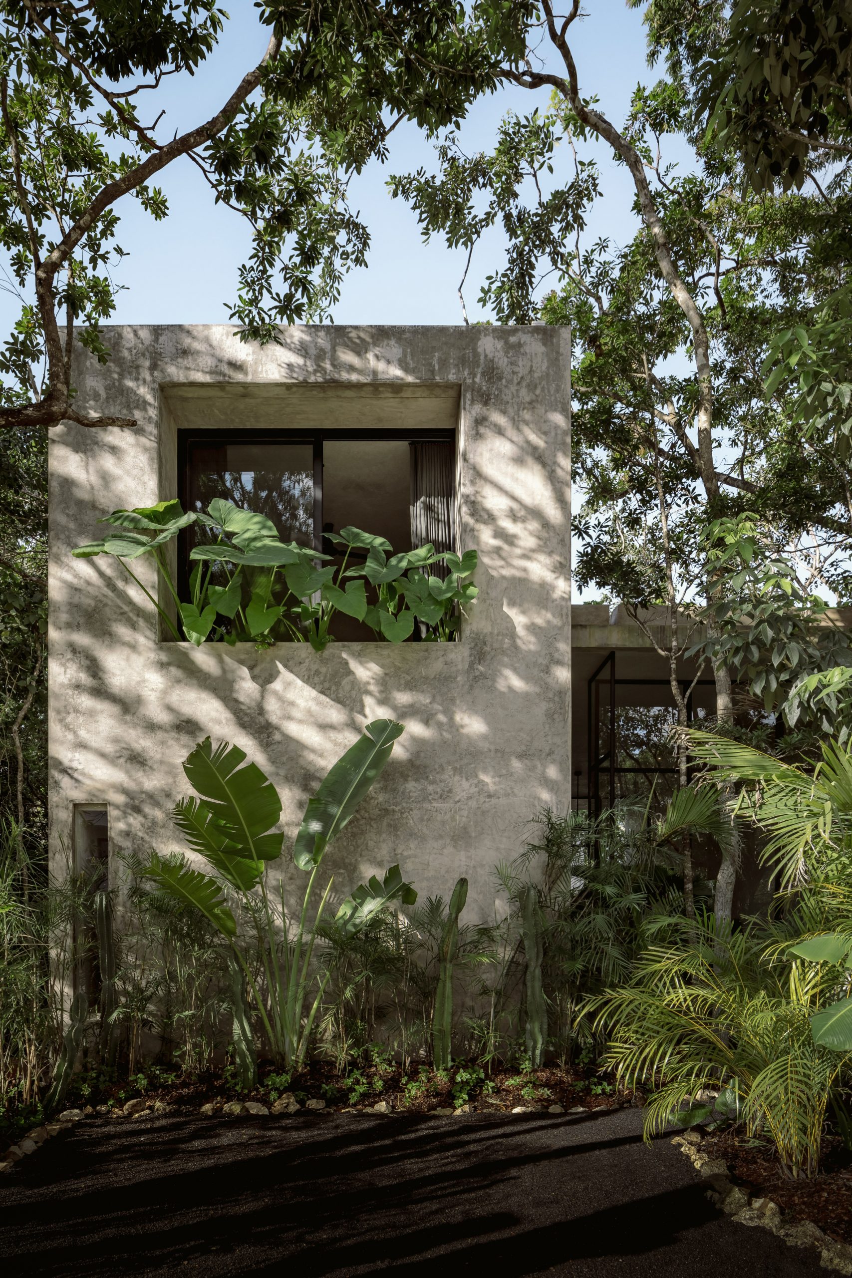
The 330 square metre home is located on the Yucatan Peninsula along the Caribbean coastline. Oriented east to west to take advantage of the prevailing winds and cross ventilation, this rental home was built with low maintanence durability in mind. I love the simple design choices such as hand polish cement covering the concrete walls and the double height ceiling in the living and dining area along with the black terrazzo flooring. My absolute favourite part of this home are the pivoting glass doors that open to create flow from the living area to small but gorgeous swimming pool and garden.

The home also has a rooftop terrace that can be enjoyed by guests. Many of the furniture and light fixtures throughout Casa Aviv were also designed and fabricated by Co-Lab. Both the styling and the colours used throughout the home help it to further connect with its natural surroundings. Love it!

What do you think of this vacation home? Would you like to experience it for yourself? Let me know in the comments below. All images via http://www.dezeen.com
Thank you for stopping by Stylishly Zen today and I hope that you have a beautiful day! XXS

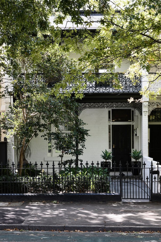


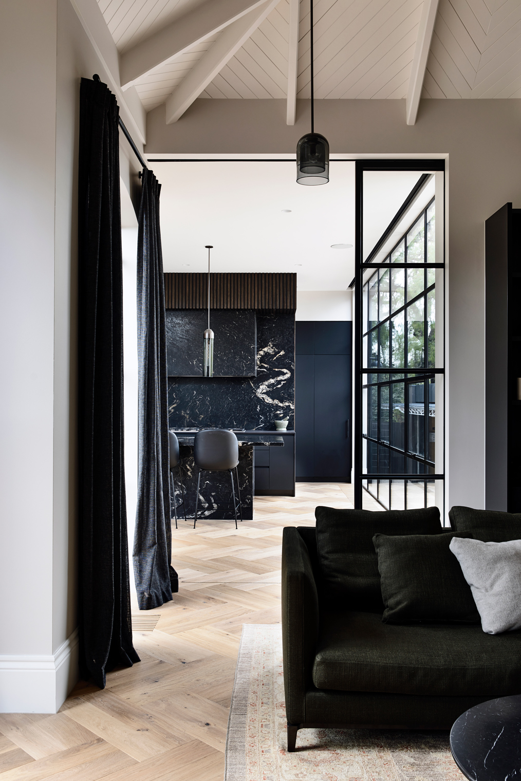
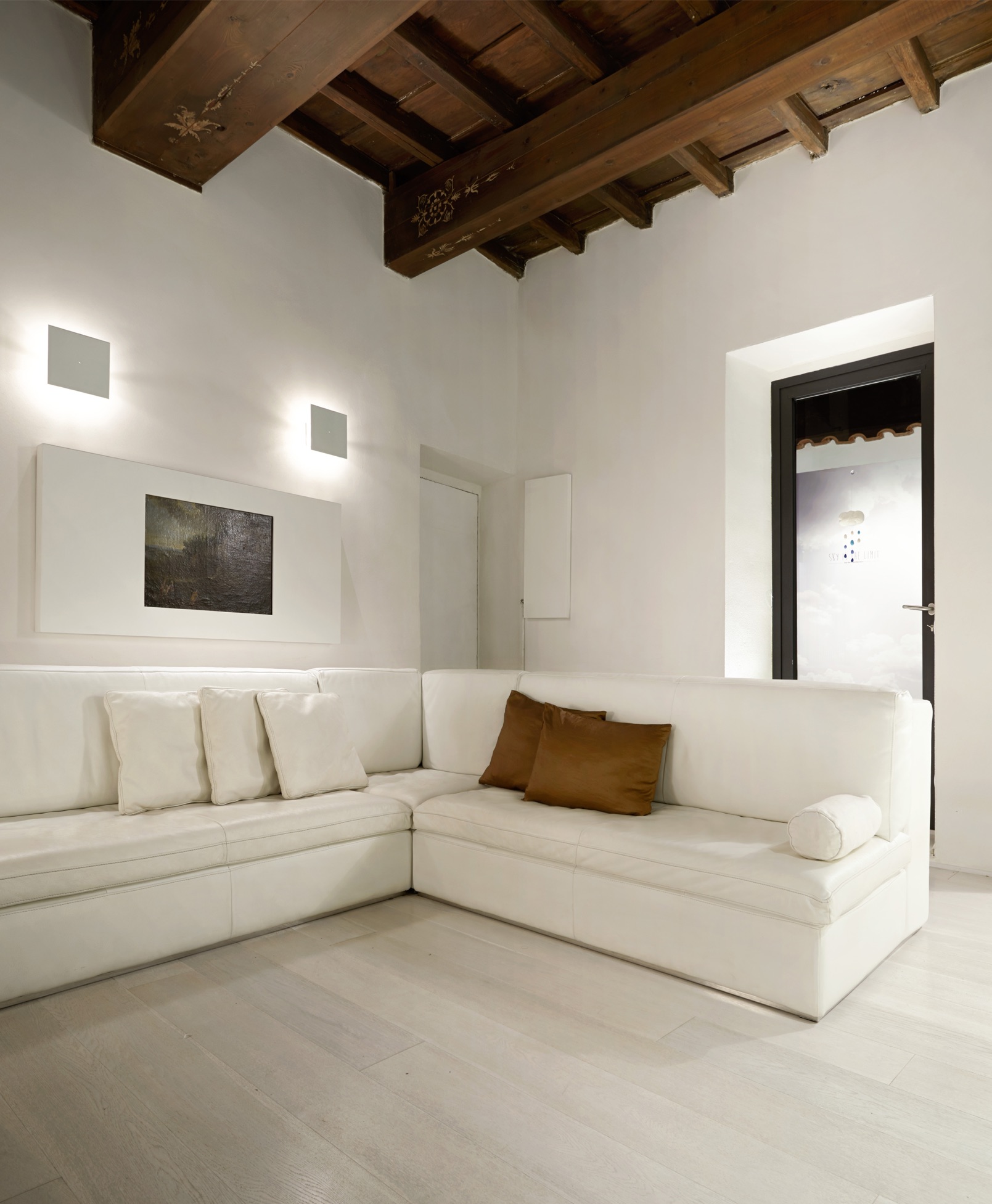
 The Dutch Gable House by Austin Design Associates is the design firm behind the dreamy and contemporary renovation of this historic Melbourne home. The renovation seamlessly melds the existing Edwardian and Federation details with an elegant colour and material palette and modern design. The result is a timeless and sophisticated home that is a design lovers dream.
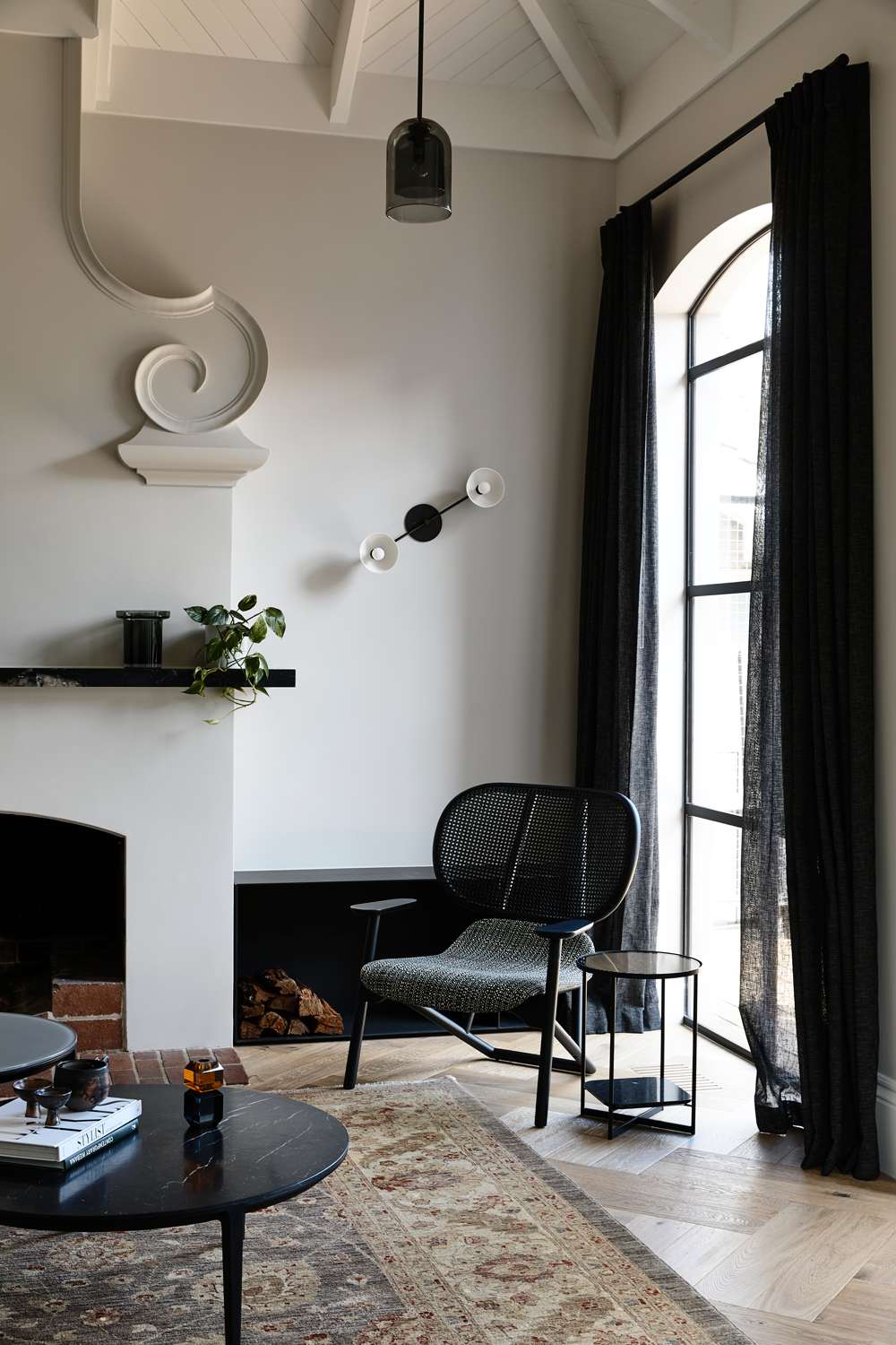
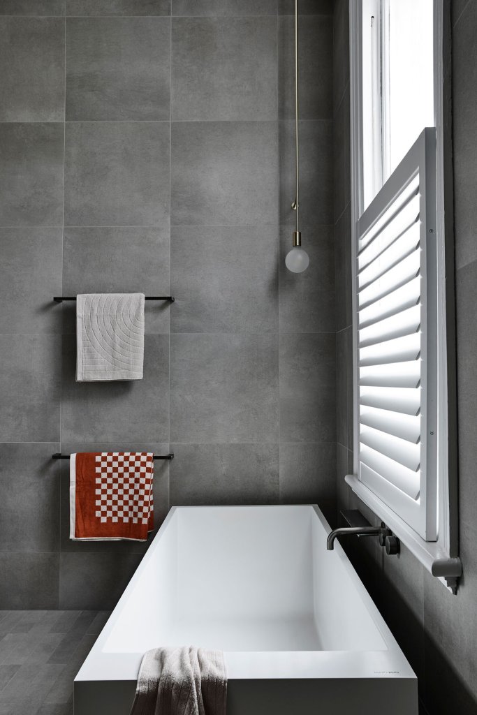
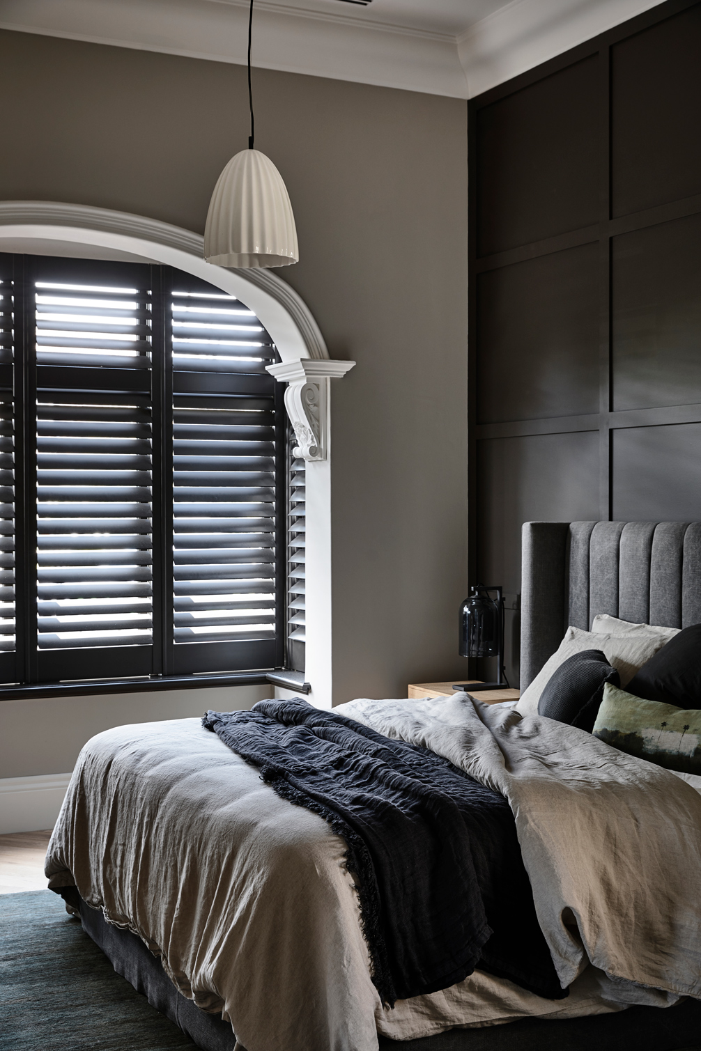 The combination of stunning materials such as Cote D’Azur marble, oak herringbone floors and titanium granite along with the steel floor to celling windows which invite an abundance of natural light, and details such as freestanding tubs and restrained decor make this home bright, inviting and chic.
 The outdoor space is equally restrained yet inviting. It looks like the perfect spot to enjoy a sunny afternoon with a great book and glass of rose.
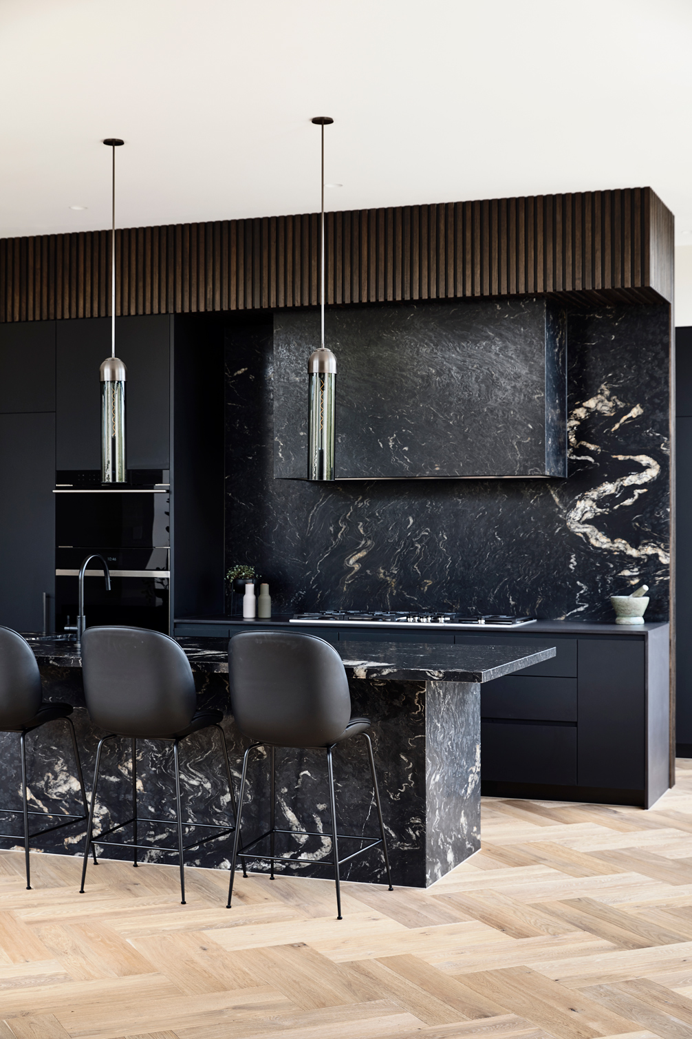
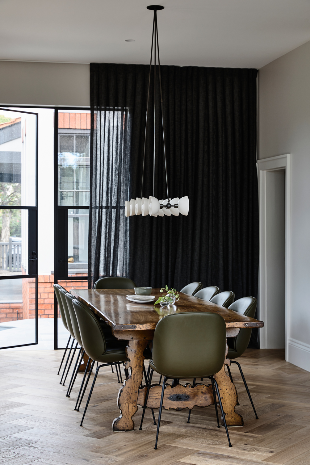
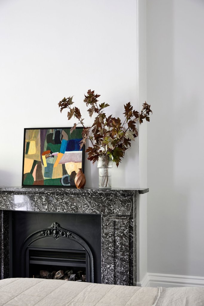
 The proverbial icing on this beautiful home are the furnishings that elevate the materials used throughout the home. From the deep green dining chairs paired with a statement wood dining table, cool and varied lighting choices and the mix of furniture using both natural textures and sleek design, I can’t think of anything that I would change in this home. Love it!


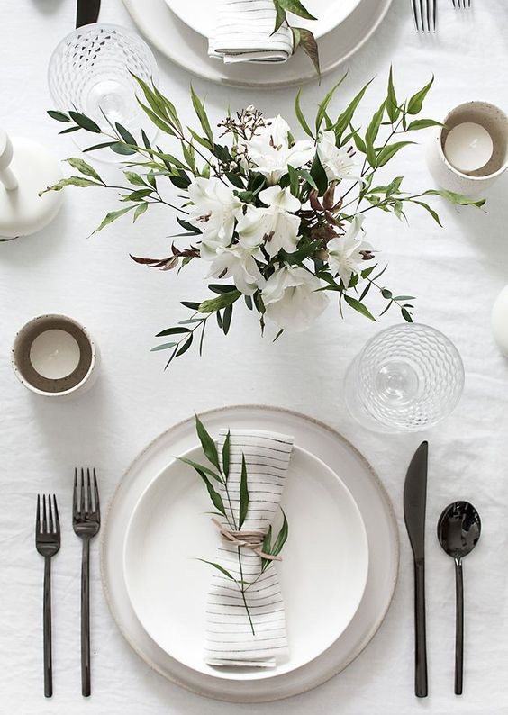

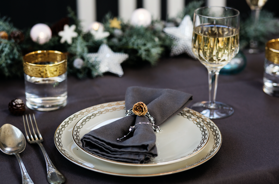
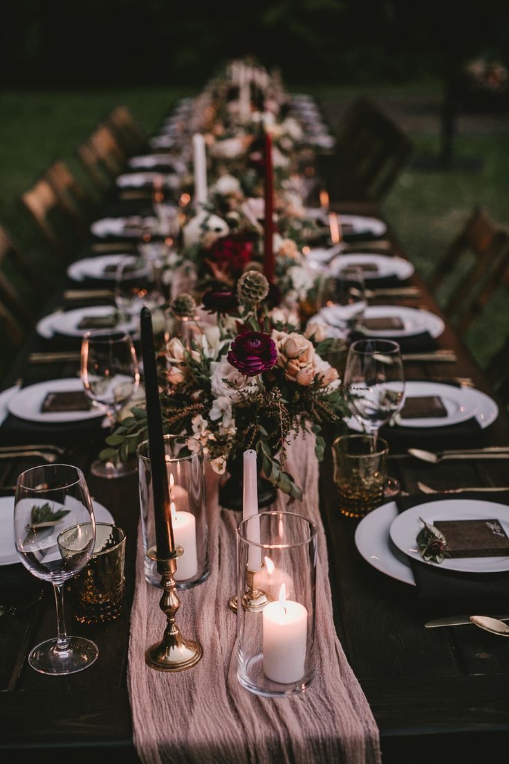
 I love the look for pewter and gold together but it is a colour combination that is often overlooked. When I came across the image above on Instagram the other day, I was once again reminded what a strong impact this colour combination can have. Pewter toughens up the glamour of the gold just enough without overpowering it. Whether featured on a table setting or combined in an outfit, this colour combination has staying power into 2020 and beyond. I also love how black helps to anchor a table setting of pewter and gold, don’t be afraid to mix it up and play around with this colour combination.
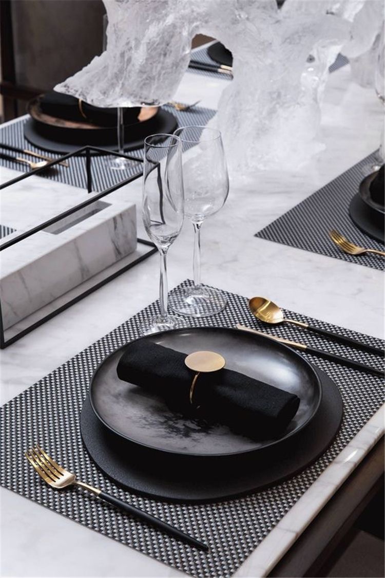
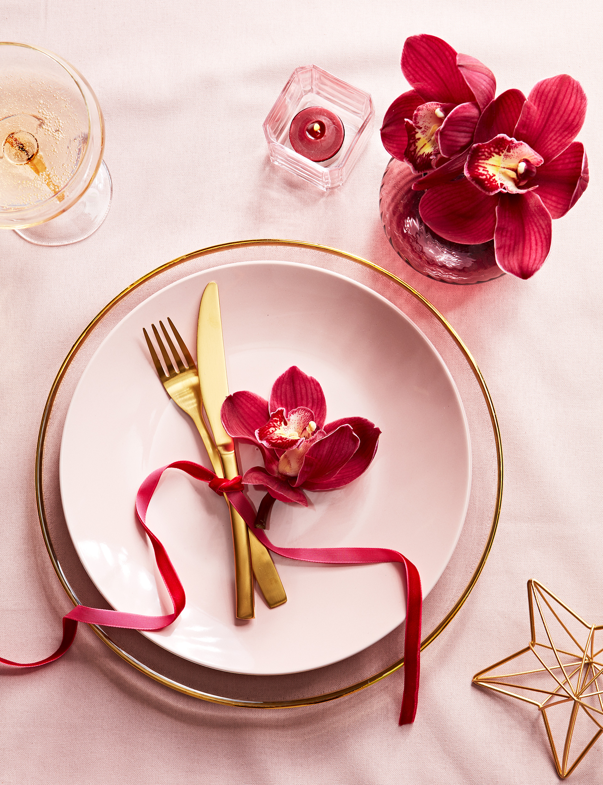
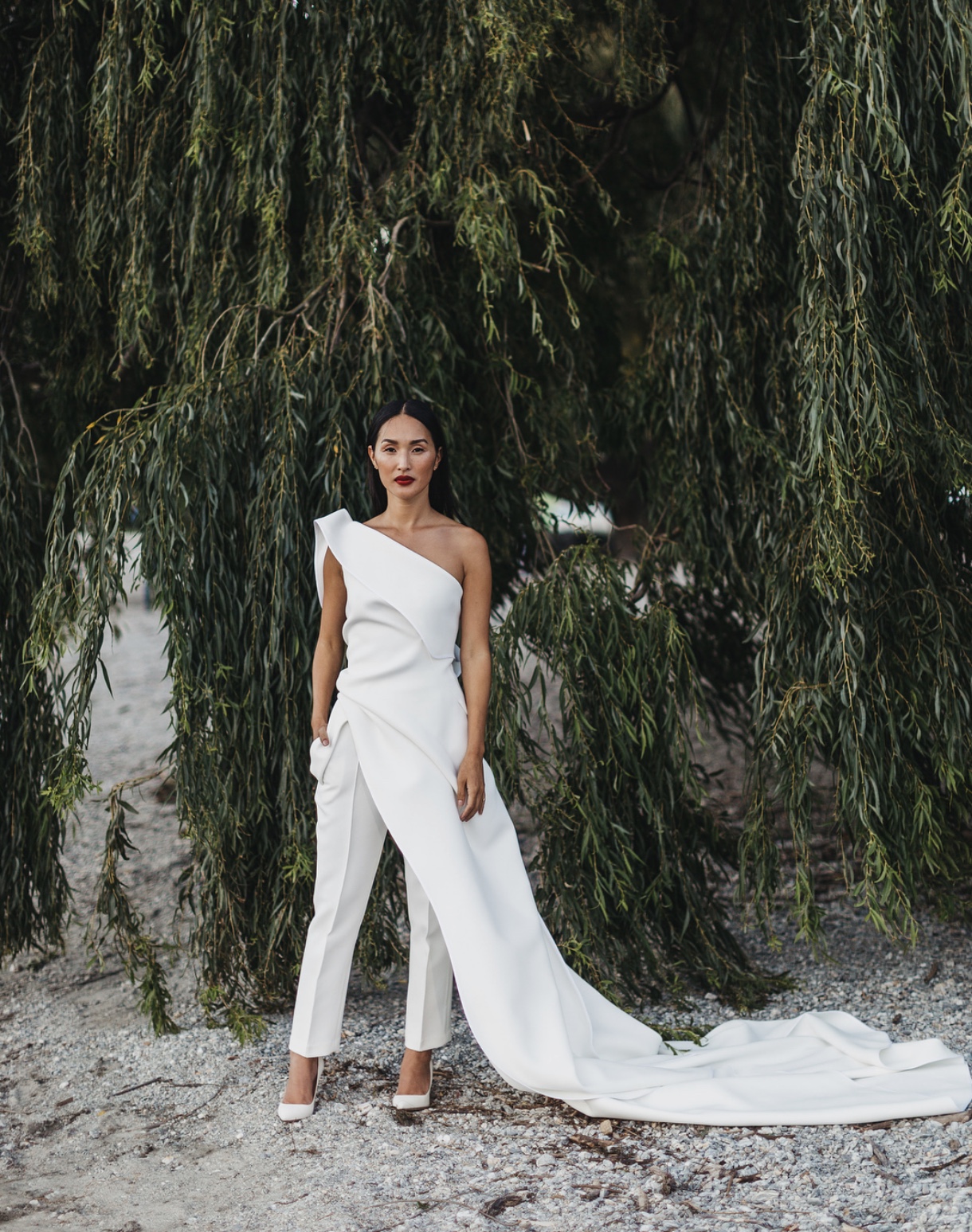
 This colour combination tends to be used more for Valentine’s Day celebrations, but I love how fresh it is for the holiday season. The deeper red feels traditional and rich, while the pale pink gives it a modern and unexpected twist. I especially love the outfit below with the pale pink pants and deep red sweater, it features this colour palette so beautifully. I am obsessed!