Hi Everyone!
I have been a fan of stylist Monica Rose for a few years. I love her ability to mix basics with beautiful textures and tones, resulting in looks that are best described as polished, cool and effortlessly layered. When Monica was styling her new home a while ago she turned to Julie Van Daele of Well Recieved. I have been a fan of Julie’s work for a long time and her design style complements Monica’s perfectly.
This project was recently profiled in Lonny magazine and it is everything that I expected and more. The natural colour palette layered with beautiful and sophisticated textiles, this home is a soothing refuge from a chaotic world.

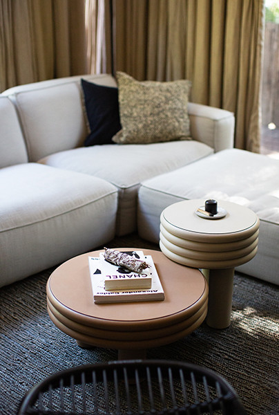
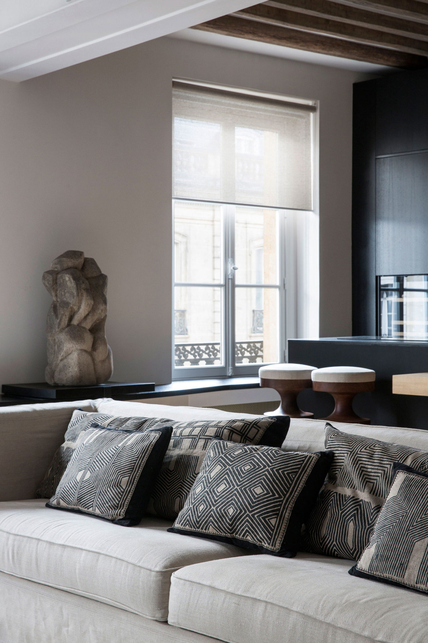
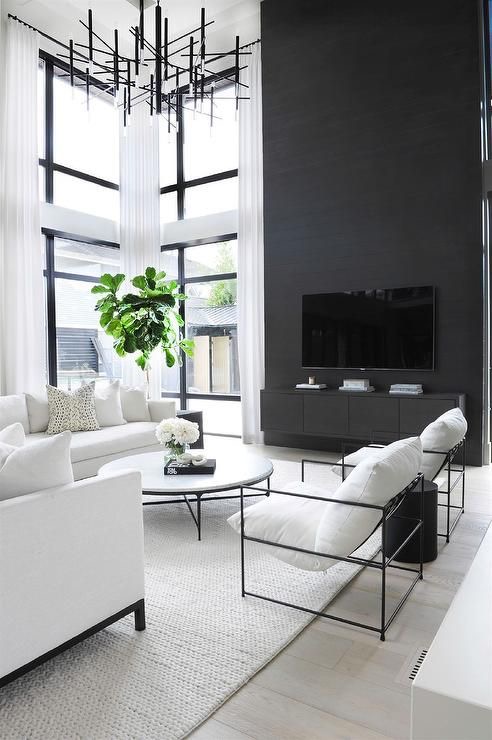
I love the combination of cream, black and cognac and the mix of leather and wood throughout the home gives it a warm masculine vibe that is timelessly cool.

There are many things that I love about this home but my absolute favourite is the gorgeous wood dining table paired with reupholstered vintage dining chairs. The metal frame on the two end chairs is eye catching and edgy and creates an unexpected but cool visual interest within the space. Love it!

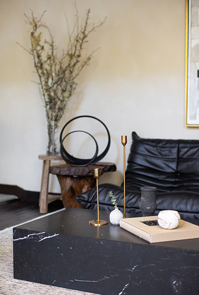
Just as you would expect from a stylist to the stars and a very talented designer, this house is filled with gorgeous Instagramable furniture. The Line Reset Togo sofa paired with the Flag Hayland chair creates a cool living space that is both welcoming and photograph worthy. The black marble block coffee table and vintage wood stools as side tables are the perfect accent pieces to such lust worthy furniture.
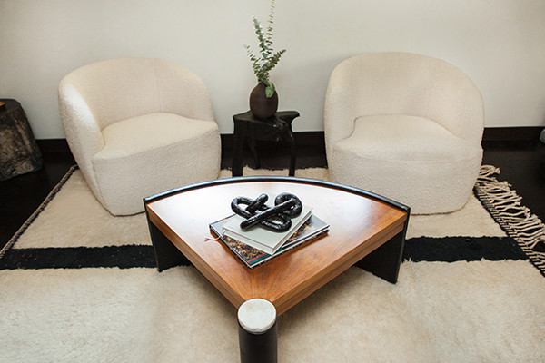
The use of beautifully textured area rugs throughout the home create intimate spaces to enjoy and the addition of plants of different sizes helps to bring a touch of nature and colour within each space.

This LA abode is a fitting for a talented A-list stylist and perfectly captures her style. It’s yet another example why Well Received is one of my favourite American interior designers.
Thank you for stopping by Stylishly Zen today and I hope that you have a wonderful day! XXS
All images were photographed by Michelle Mosqueda for Well Received via http://www.lonny.com


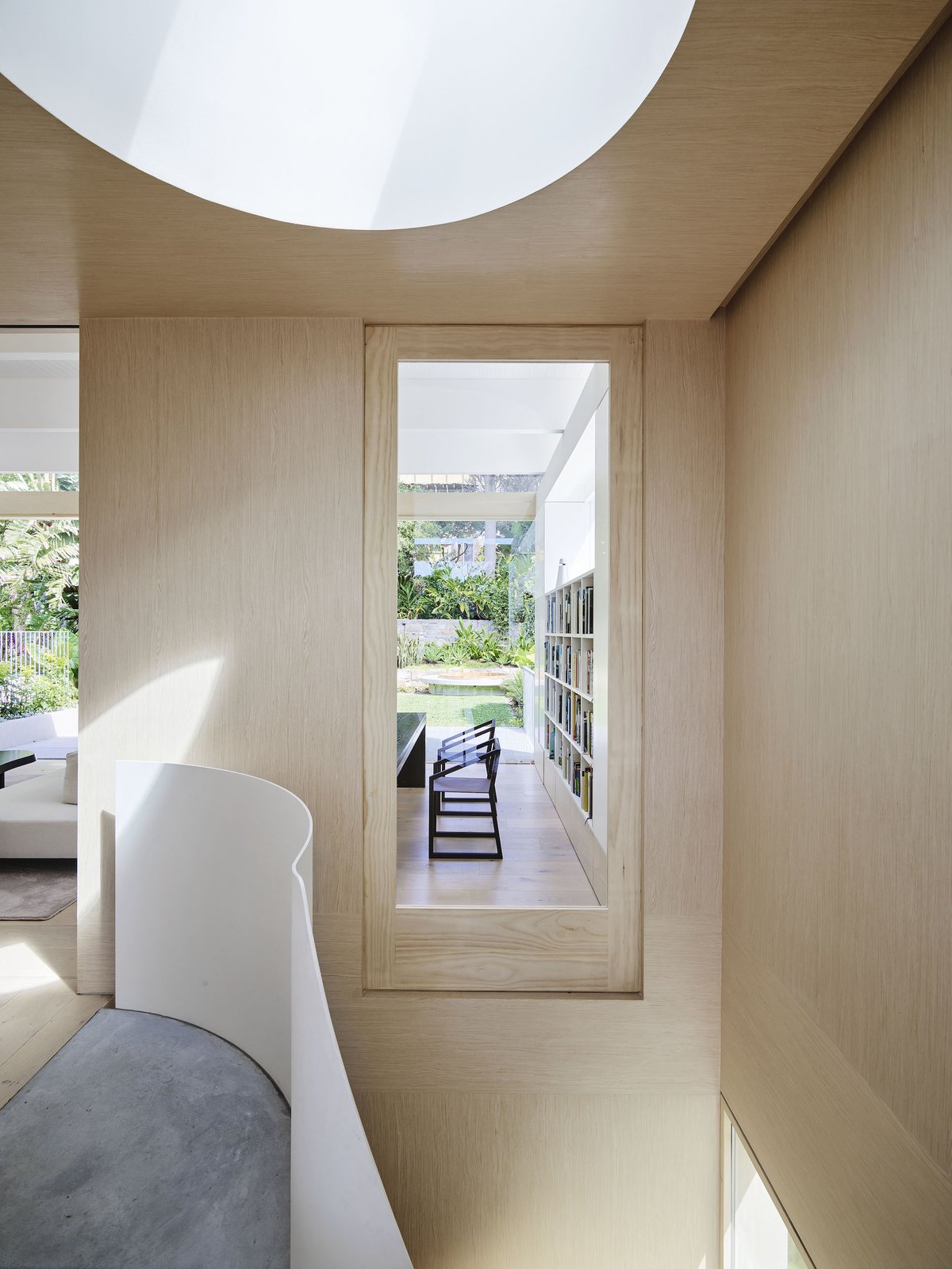
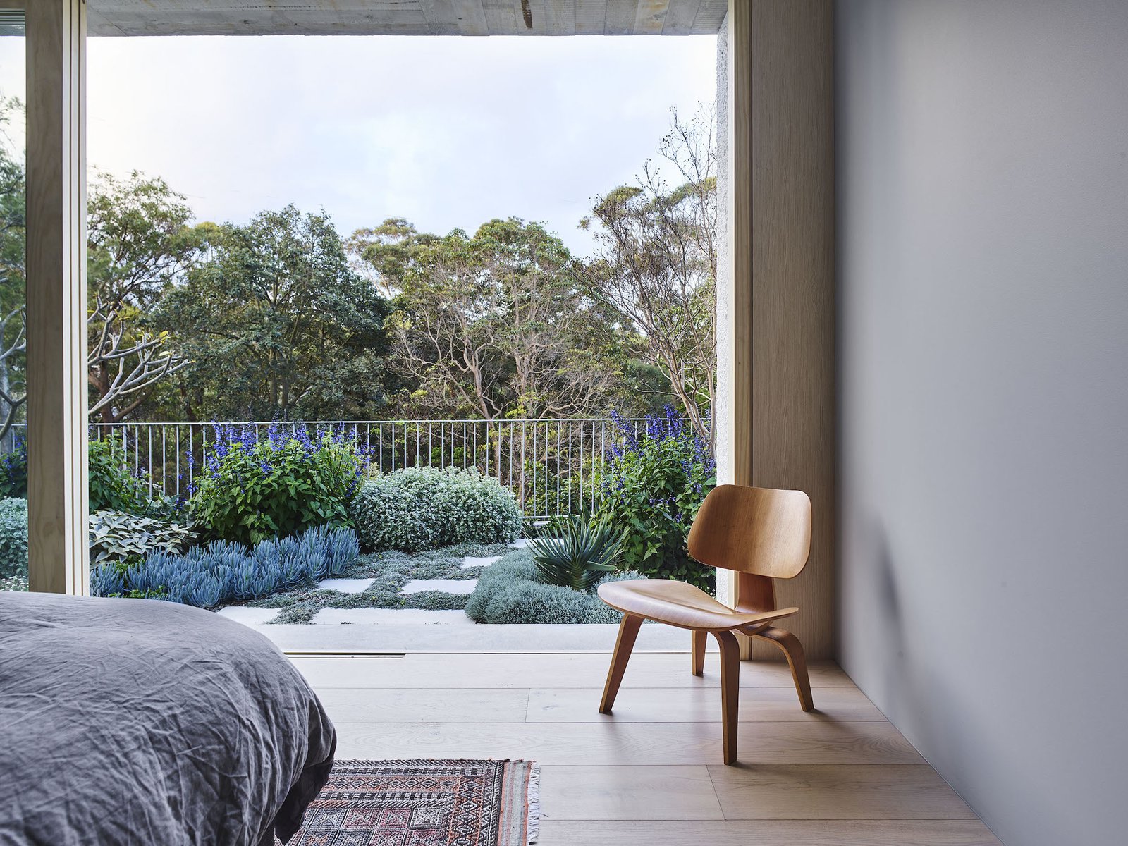
 Today’s dreamy design is unique in many ways. It’s a renovated 1920’s bungalow in Sydney that had an addition added to it in the 80’s. It was in dire need of a makeover and thankfully the owners were up to the task. It order to make the most of the natural light that filled the top floor of the house the owners decided to flip the living spaces by moving the common areas such as the kitchen and the living room to the top floor and the bedrooms to the lower level. Normally I dislike this sort of flipped design as I don’t like the idea of sleeping in a bedroom on street level but in this case the home is elevated. Entry to the home is via a set of concrete steps that lead to the main entrance. Due to the elevated design, the bedrooms are above street level.
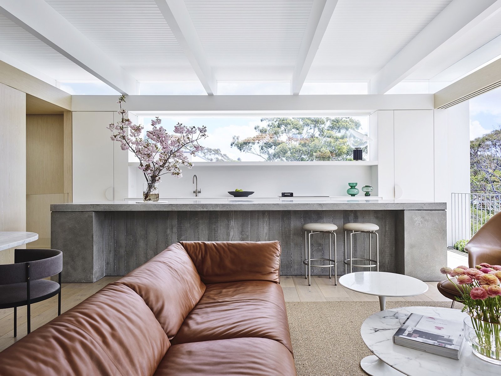
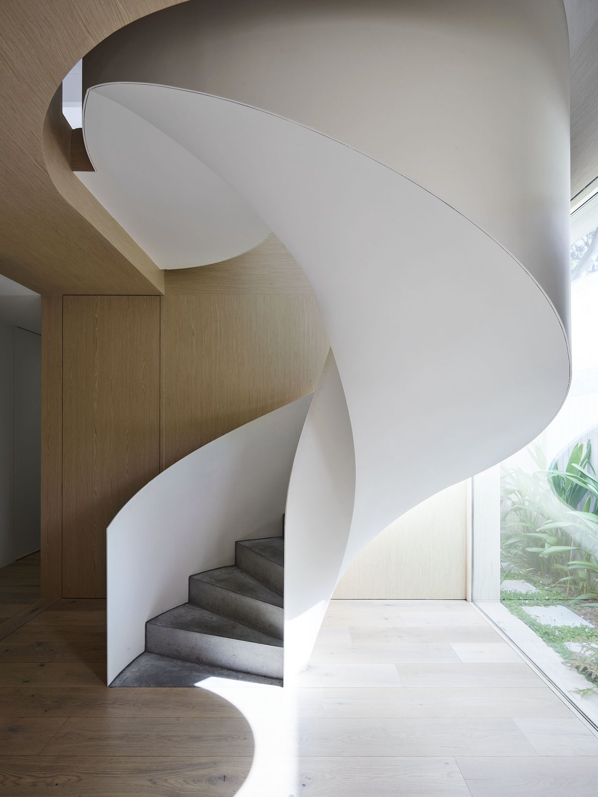
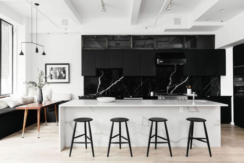
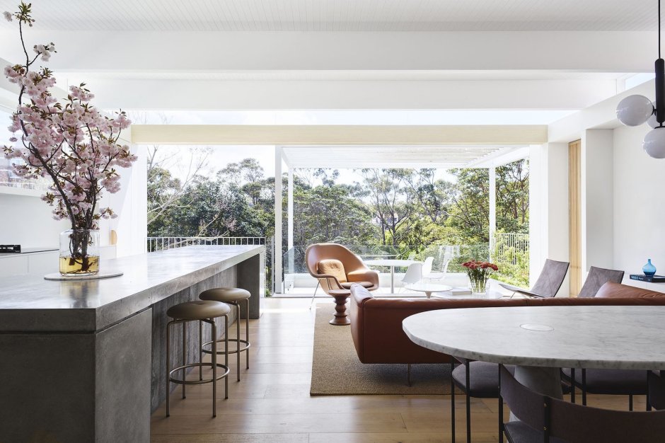
  The common areas are bright open spaces with large windows and tall ceilings that helps the home to feel immersed in nature. Combined with a modern yet timeless aesthetic, the flow of the home is streamlined. I especially love the board formed concrete counter in the kitchen as it adds a cool industrial vibe to the space. There are massive sliding glass doors in the kitchen that open onto a concrete patio that overlooks the street in front of the home. This level is organized into both active and quiet zones that can be separated by sliding glass doors.